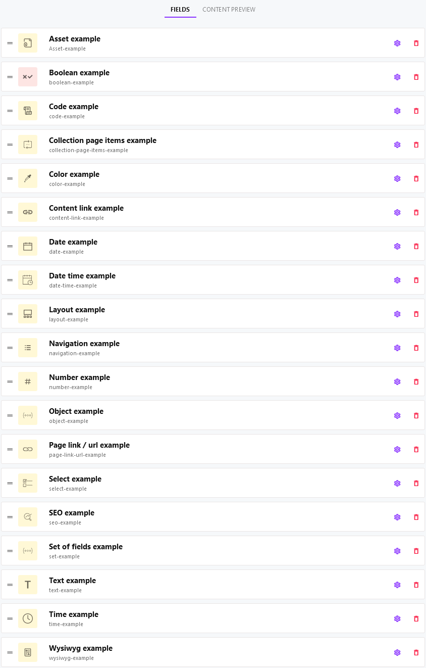
Fields
Cockpit provides a set of fields for structuring and managing your content.
It is generally not recommended to use kebab-case for field names, but instead camel-case (fieldName).
- Field types
- Asset
- Boolean
- Code
- Collection page item
- Color
- Content link
- Date
- Date time
- Layout
- Navigation
- Number
- Object
- Page link / url
- Select
- SEO
- Set of fields
- Text
- Time
- Wysiwyg
Field types
Content models (singletons and collections) as well as pages consist of a various number of user-defined fields. When creating fields, you can choose from a list of field types described in this section.
Depending on the field type the content model's data contains different values. These values are described foreach field type in this section of the documentations as Example result.
We use example field names and configuration to provide you with concrete example data. Depending on your field configuration, the values and structure differ from these.
Asset
The Asset field displays a button to link any asset from your list of Assets within the content model form.
Use an Asset field whenever you intend to reference assets from your content models.
Example result:
"assetField": {
    "path": "/path/to/the/asset/filename.pdf",
    "title": "filename.pdf",
    "mime": "application/pdf",
    "type": "document",
    "description": "",
    "tags": [],
    "size": 469386,
    "colors": null,
    "width": null,
    "height": null,
    "_created": 1638823596,
    "_modified": 1638823596,
    "_cby": "ab64ef93343265d420000110",
    "folder": "",
    "_id": "aefbbc4638363554f700010e"
}
Boolean
The Boolean field displays a simple toggle to switch on or off. Actually it is an improved checkbox, with the toggle activated (indicated by the green color) as the checkbox checked status and the toggle deactivated (indicated by the red color) as the checkbox unchecked.
Use a Boolean field whenever you want to have a simple boolean value in your content models.
Example result:
"booleanField": falseCode
The Code field displays a textarea with monospace font and line numbers.
Use a Code field whenever you intend to display code samples.
Example result:
"codeField": "<?php\n\n// This is my first hello world example\necho \"Hello world\";\n\n?>"Collection page item
The Collection page item field is a feature rich complex field type. When using this field type you can specify the collection to use. Later, when providing content for the field, you can choose the desired page from your list of Pages of type Collection.
Use a Collection page item field, whenever you want to display a configurable number of Collection items, that have been selected to be displayed in one of your Pages.
Example result:
"collectionPageItemsField": {
    "items": [], // the list of collection items if any
    "pageCollectionId": "6816061a6665321201000124",
    "limit": 4
}
Color
The Color field displays a simple color picker to choose color from.
Use a Color field whenever you want to use a color value in your content model data.
Example result:
"colorField": "#ff0000"Content link
The Content link field displays an element to link content from your Collections. When using this field type you can specify the collection to use. Later, when providing content for the field, you can choose one item from the collection specified.
Use a Content link field, whenever you want to link content from one of your Collection items.
Example result:
"content-linkField": {
    "_model": "faq", // faq is an example here, this will be your collection's name
    "_id": "ae7459d63939362ba5000384" // the id of the selected item
}
Options
display: Displey preview of linked content item. Example:${data.title}
Date
The Date field displays a simple date picker to choose a date from.
Use a Date field whenever you want to use a date value in your content model data.
Example result:
"dateField": "2021-12-22" // your date in format YYYY-MM-DDDate time
The Date time field displays a simple date picker to choose a date from as well as a time input.
Use a Date time field whenever you want to use a datetime value in your content model data.
Example result:
"date-timeField": "2021-12-24 12:00" // your date in format YYYY-MM-DD HH:iiLayout
If you do not see the Layout field type in the list of field types of your Cockpit installation, you're probably missing the Layoutaddon. Please make sure to install it.
The Layout field displays a highly configurable component, that allows creating layout based content as known from websites and applications including:
- Button
- Grid
- Heading
- HTML
- Link
- Markdown
- Richtext
- Section
- Spacer
Use a Layout field whenever you want to provide data in a layout for websites or applications. This feature is especially useful when it comes to creating and editing data for Pages.
Further information on layout components and configuration options can bee found in the Layout addon section.
Example result:
"layoutField": [
    {
        "component": "section",
        "label": "my-first-example-section",
        "children": [
            {
                "component": "heading",
                "label": "Heading",
                "children": null,
                "data": {
                    "text": "This is my first heading",
                    "level": "1"
                }
            },
            {
                "component": "richtext",
                "label": "This is my first richtext",
                "children": null,
                "data": {
                    "html": "<p>Hello <strong>World!</strong></p>"
                }
            }
        ],
        "data": {
            "class": null
        }
    }
]
Navigation
The Navigation field displays component that allows creating a navigation or menu as known from any kind of websites, applications or documents. Available features:
- Nested items / child items
- target for links
- URL
Use a Navigation field whenever you want to provide a menu for websites or applications.
Example result:
"navigationField":  [
    {
        "title": "Example menu entry one",
        "url": "https://example.com/one",
        "target": "_blank",
        "data": [],
        "children": [
            {
                "title": "Example child menu entry ",
                "url": "#anchor",
                "target": "",
                "data": [],
                "children": [],
                "meta": []
            }
        ],
        "meta": []
    },
    {
        "title": "Example menu entry two",
        "url": "https://www.example.com/two",
        "target": "",
        "data": [],
        "children": [],
        "meta": []
    }
]
Number
The Number field displays a simple number input.
Use a Number field whenever you want to provide a numeric value your content model data.
Example result:
"numberField": 42Object
The Object field displays a textarea with monospace font and line numbers. Within this textarea you can provide JSON object data.
Use a Object field whenever you intend to store some kind of meta-data, settings or options within your content model data. Note, that this field type requires special knowledge about JSON and is not suitable for all users.
Example result:
"objectField": {
    "key": "value"
}
Page link / url
The Page link / url field displays a component, that allows you to link a page from your list of Pages.
Use a Page link / url field whenever you intend to reference a page from your data.
Example result:
"pageLinkField": "pages://6816061a6665321201000124"Select
The Select field displays a HTML select (dropdown). It contains the list of options you specify in its settings and allows multi-select if you want to.
Use a Select field whenever you want to choose an option from a predefined list of options available.
Example result:
"selectField": "Example option B" // contains the value of your option selectedSEO
The SEO field displays set of fields for providing seo data:
- title
- description
- image
- keywords
Use a SEO field whenever you want to provide content SEO information.
Example result:
"seoField": {
    "title": "seo example title value",
    "keywords": "seo example keywords value",
    "decription": "seo example description value",
    "image": {
        "path": "/path/to/selected/asset/example.png",
        "title": "example.png",
        "mime": "image/png",
        "type": "image",
        "description": "",
        "tags": [],
        "size": 8597,
        "colors": [
            "#d9c6c6",
            "#525252",
            "#fc0909",
            "#dc9494",
            "#fc6565"
        ],
        "width": 715,
        "height": 322,
        "_created": 1639898757,
        "_modified": 1639898757,
        "_cby": "ab64ef93343265d420000110",
        "folder": "",
        "_id": "2fd457c3376537fb3d0001e2"
    }
}
Set of fields
The Set of fields field displays set of fields you can configure whereas it serves as a container for them. Feel free to choose from all Field types available within one set of field.
Use a Set of fields field whenever you want to group a set of fields.
Example result:
"setField": {
    "fieldA": "Value of field one in set of fields",
    "fieldB": "Value of field two in set of fields"
}
Display the value of a field within the set in the form. "Field settings" > "Options" > "Display":
${data.someFieldName}If the field name is named using kebab case (generally not recommended), the following syntax will display the content of a field within the set in the form:
${data['some-field-name']}If you want to display the value of a linked content item, you just pass the field to the dedicated $content helper function followed by the value path you want to get displeyed:
${ $content(data.post, '${data.title}') }Text
The Text field displays a simple text input.
Use a Text field whenever you want to provide a simple text input for any short text values, such as titles, headlines, ...
Example result:
"textField": "Text field value"Time
The Time field displays a simple time input. It allows the configuration of minimum and maximum time as well as a list of predefined time options from within its settings.
Use a Time field whenever you want to use a time value in your content model data.
Example result:
"timeField": "11:38" // the time in format HH:iiWysiwyg
Use a Wysiwyg field whenever you want to allow HTML formatted content within your content model data.
Example result:
"wysiwygField": "<p>Hello <strong>World</strong>!</p>"